
Objective
A complete responsive redesign of My Virgin Media, including the login & registration journeys.
Research methods
Competitor audit, customer feedback review, analytics review, heatmap review, A/B testing & prototype testing.
A complete responsive redesign of My Virgin Media, including the login & registration journeys.
Research methods
Competitor audit, customer feedback review, analytics review, heatmap review, A/B testing & prototype testing.
The Team
Product Director, Head of Design, Designer, Project Manager and 4 Developers
How I helped
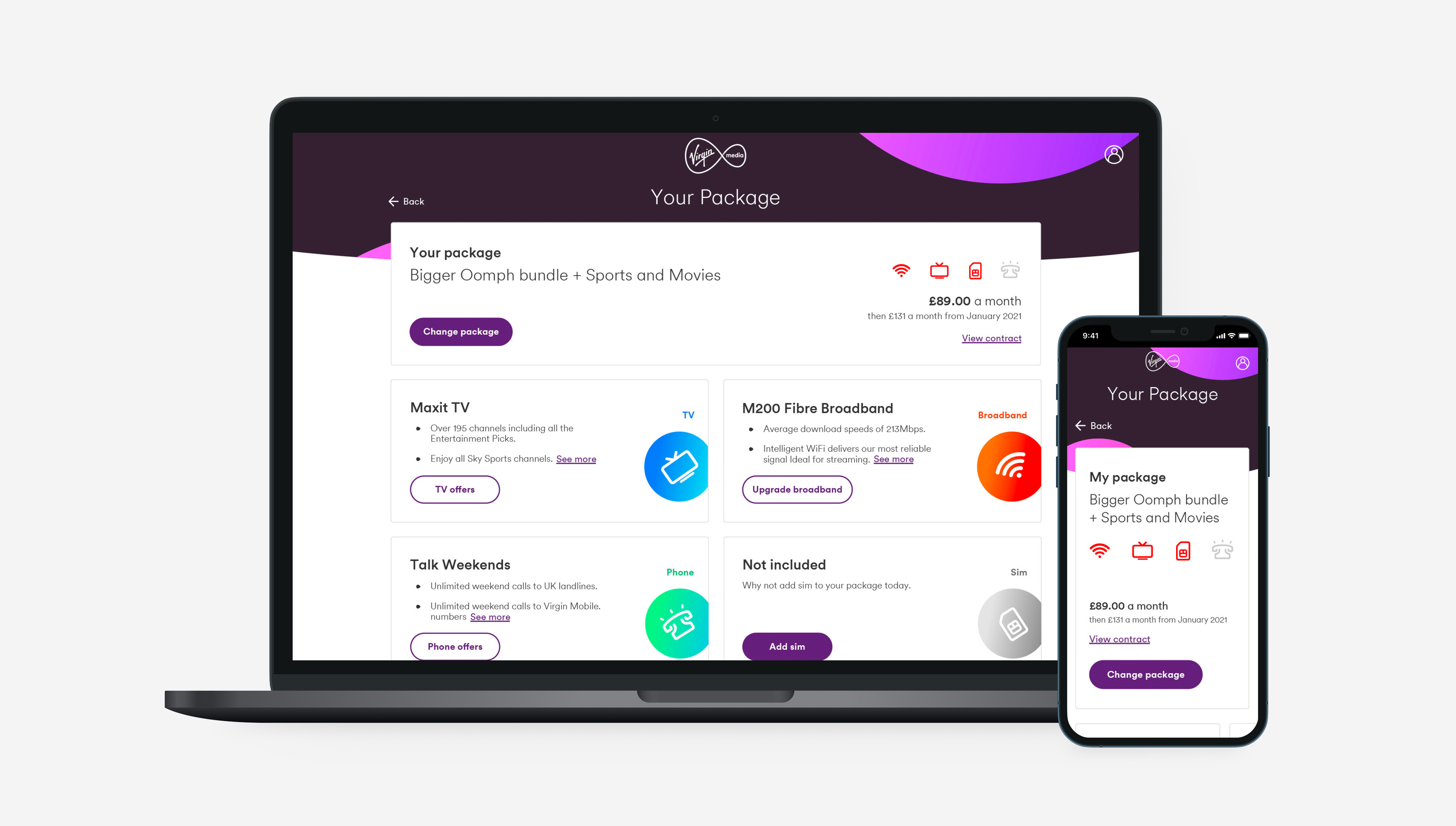
I revamped Virgin Media's My Account portal into a beautiful and very easy to use experience. Simplifying account management heavily and fully catering for every pain point discovered.
We thoroughly researched and studied not only what services the customer would be interested in, but we also heavily reviewed heatmaps to conclude the optimum experience. We also took time to review legacy designs, customer journeys and customer feedback through the feedback portal to further define the design decision and what customers really want.
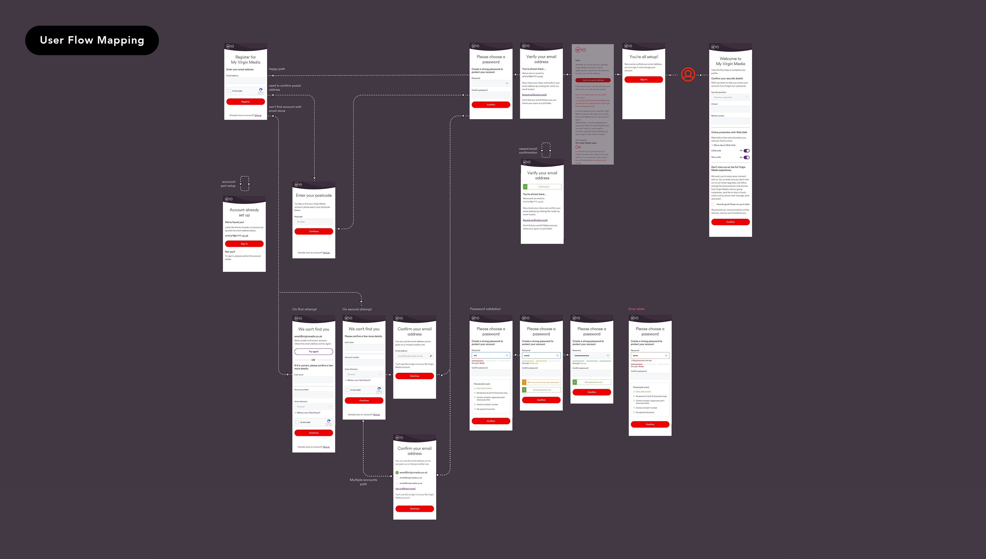
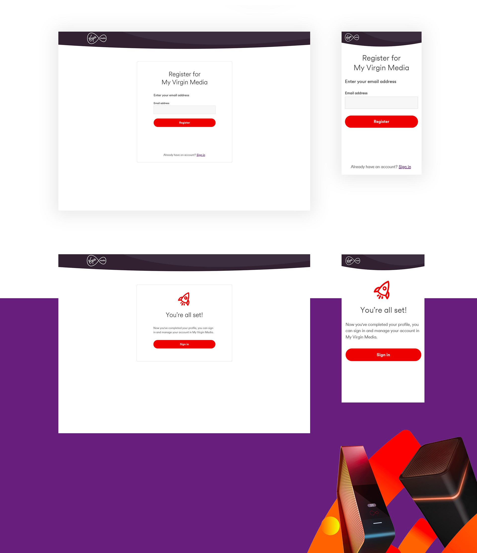
The redesign also included the full registration and login journeys.
The redesign also included the full registration and login journeys.

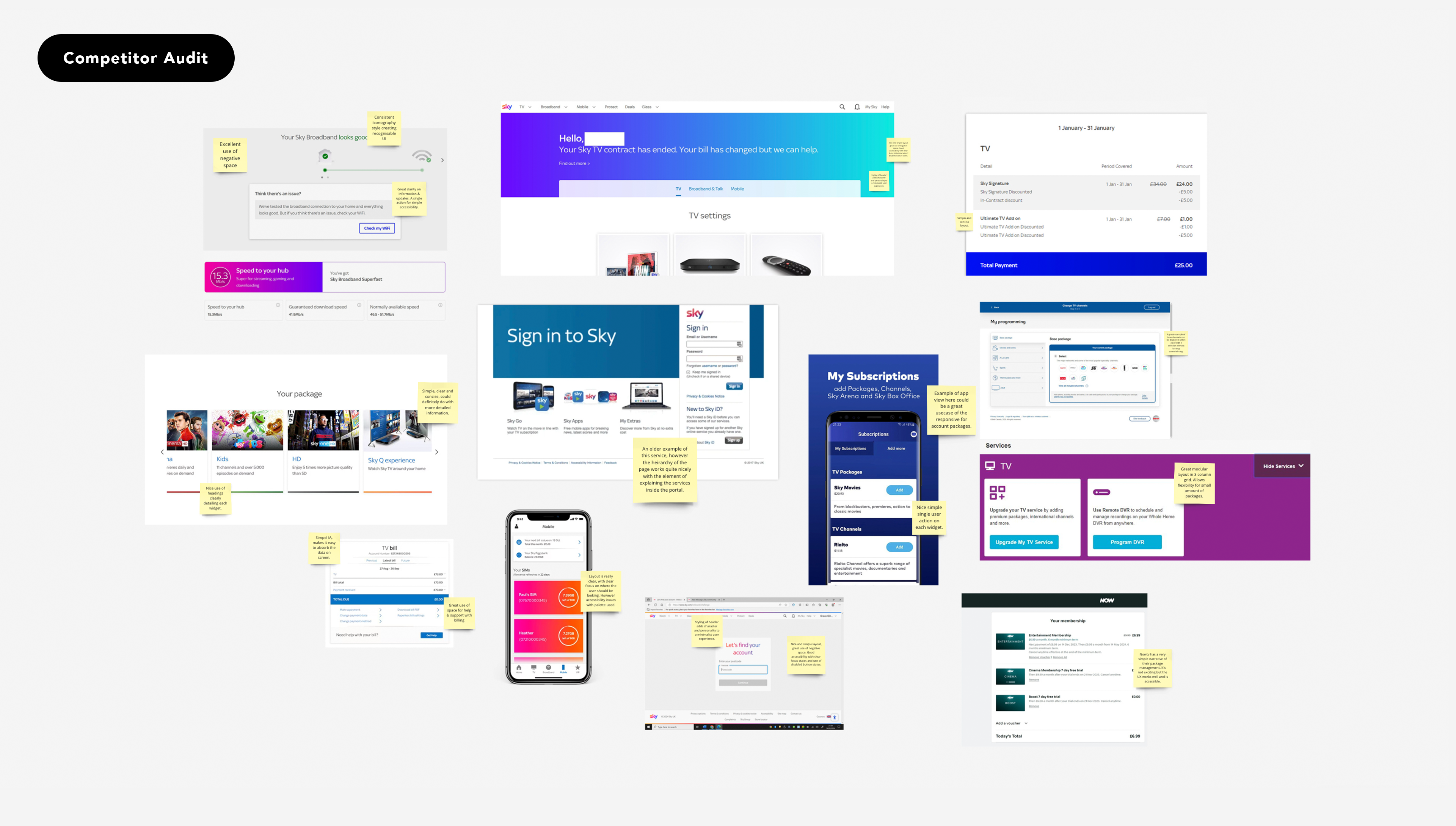
Auditing competitors to get a better understanding of the telecoms market & defining a more robust solution
This piece of research consisted of looking at other players in this space such as Sky, NowTV and even streaming platforms such as Prime Video & Netflix. This allowed us to really get an idea of what they're doing, how they're doing it and how we can further improve it.
All of this data provided us with the first piece of evidence to support our hypothesis, assumptions and later in the design process help validate our design thinking.
All of this data provided us with the first piece of evidence to support our hypothesis, assumptions and later in the design process help validate our design thinking.
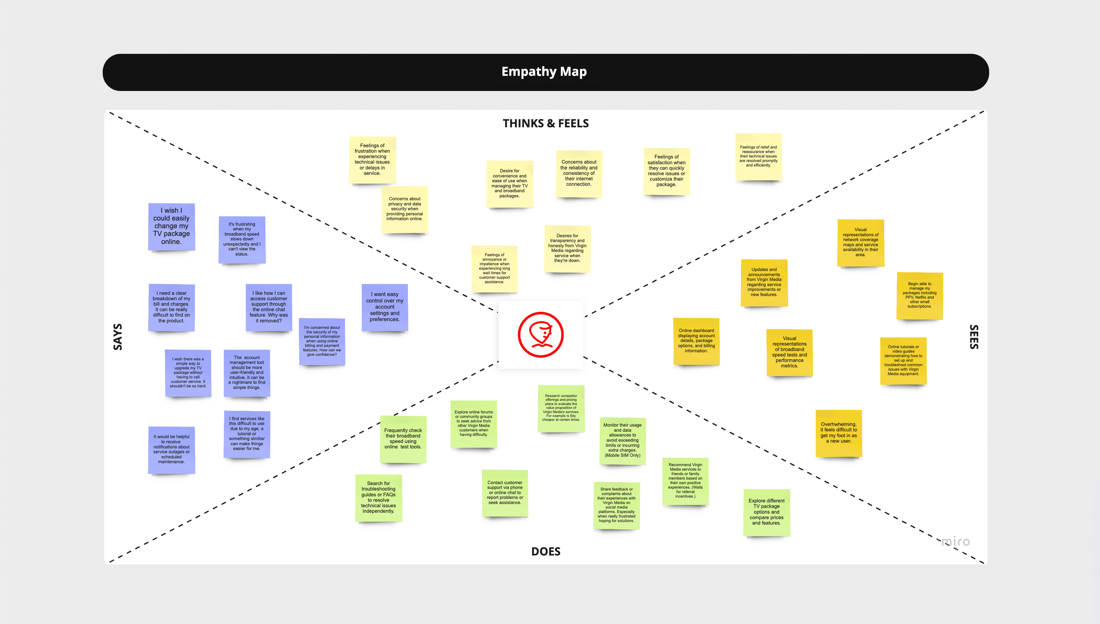
Conducting research on user behaviour to discover their pain points & evaluating feedback from the complaints portal
As part of our research process, we reviewed the analytics data collected from hotjar heatmaps which were incredibly helpful in deciphering where users are and are not interacting. We also heavily took into consideration the customer complaints to really understand their pain points. Ultimately this review allowed us to gather quantitative data on user engagement, behavior, and satisfaction with the existing product.
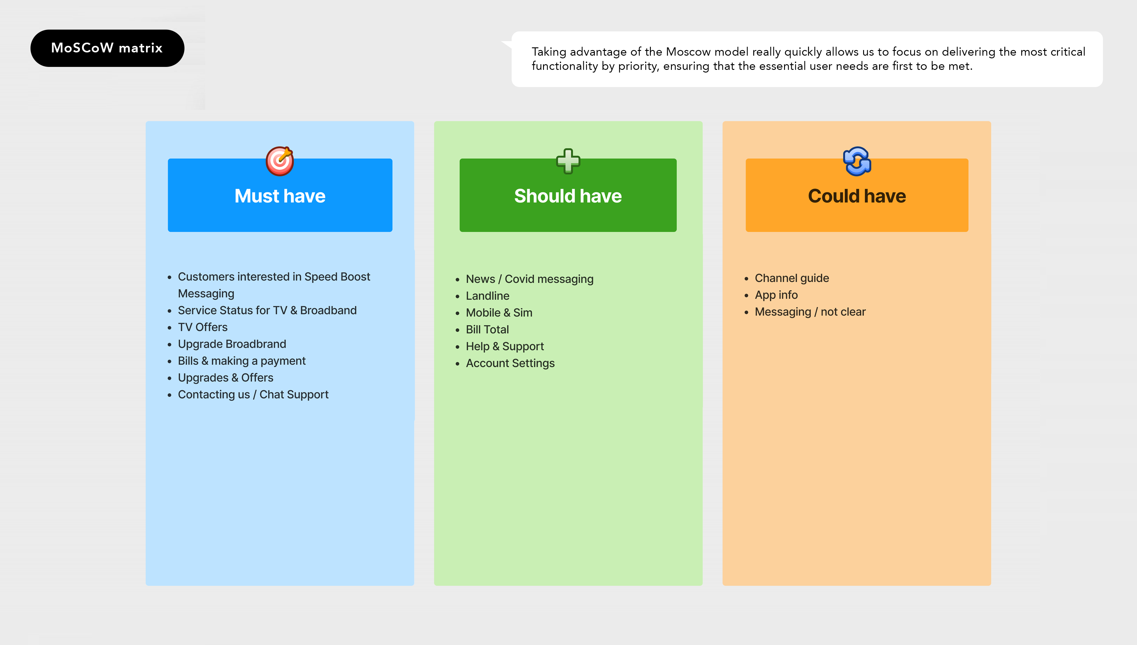
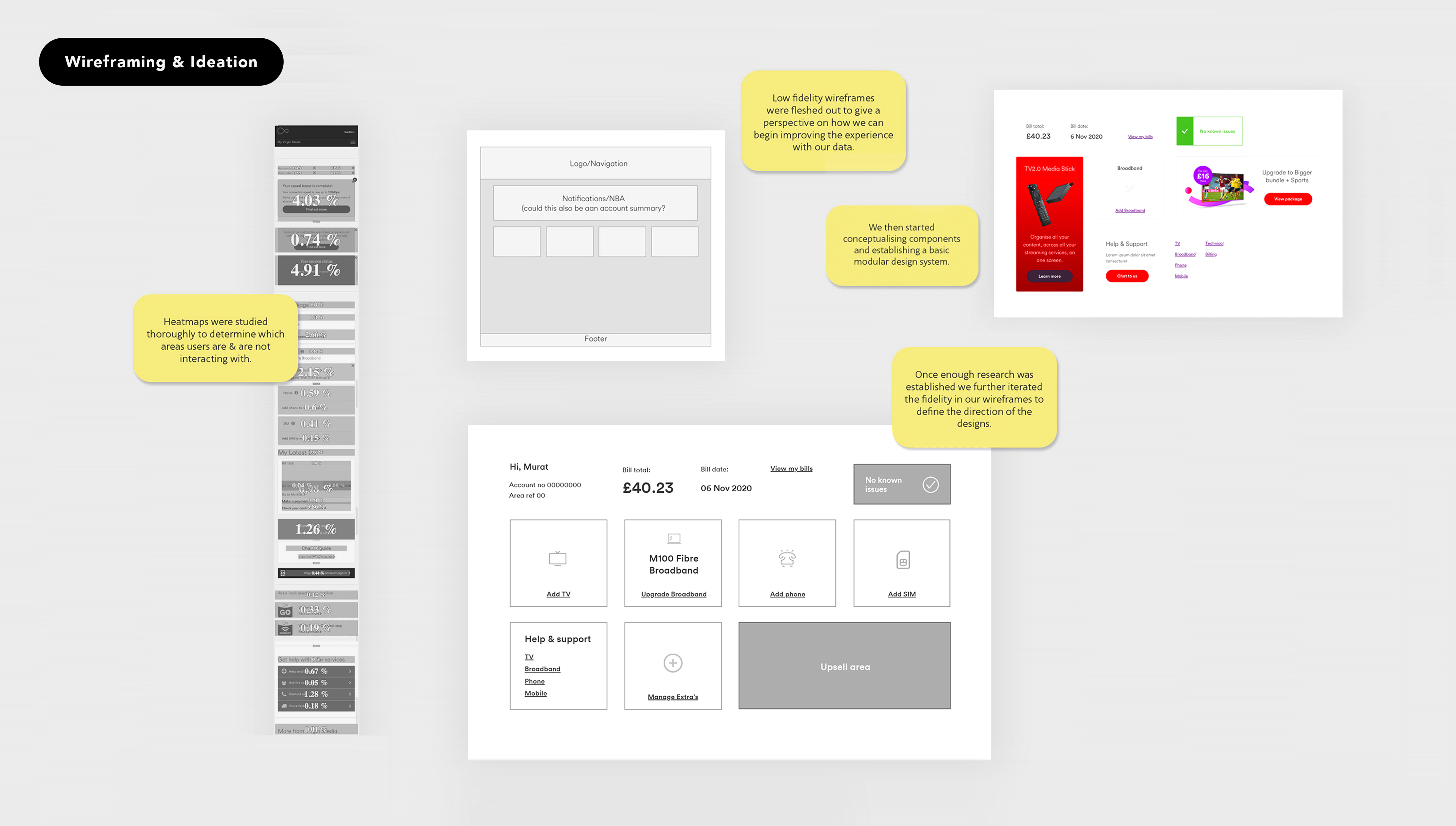
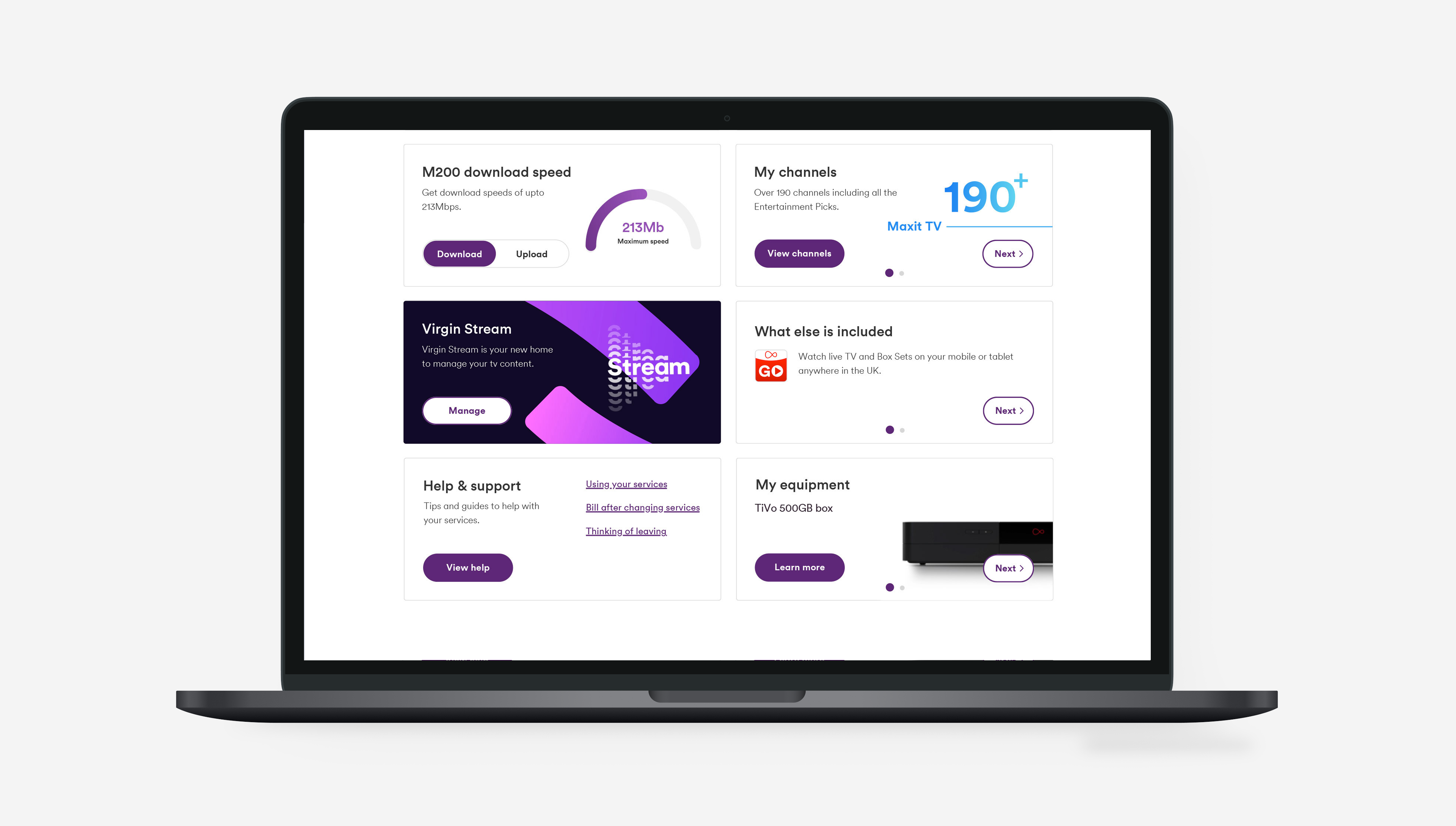
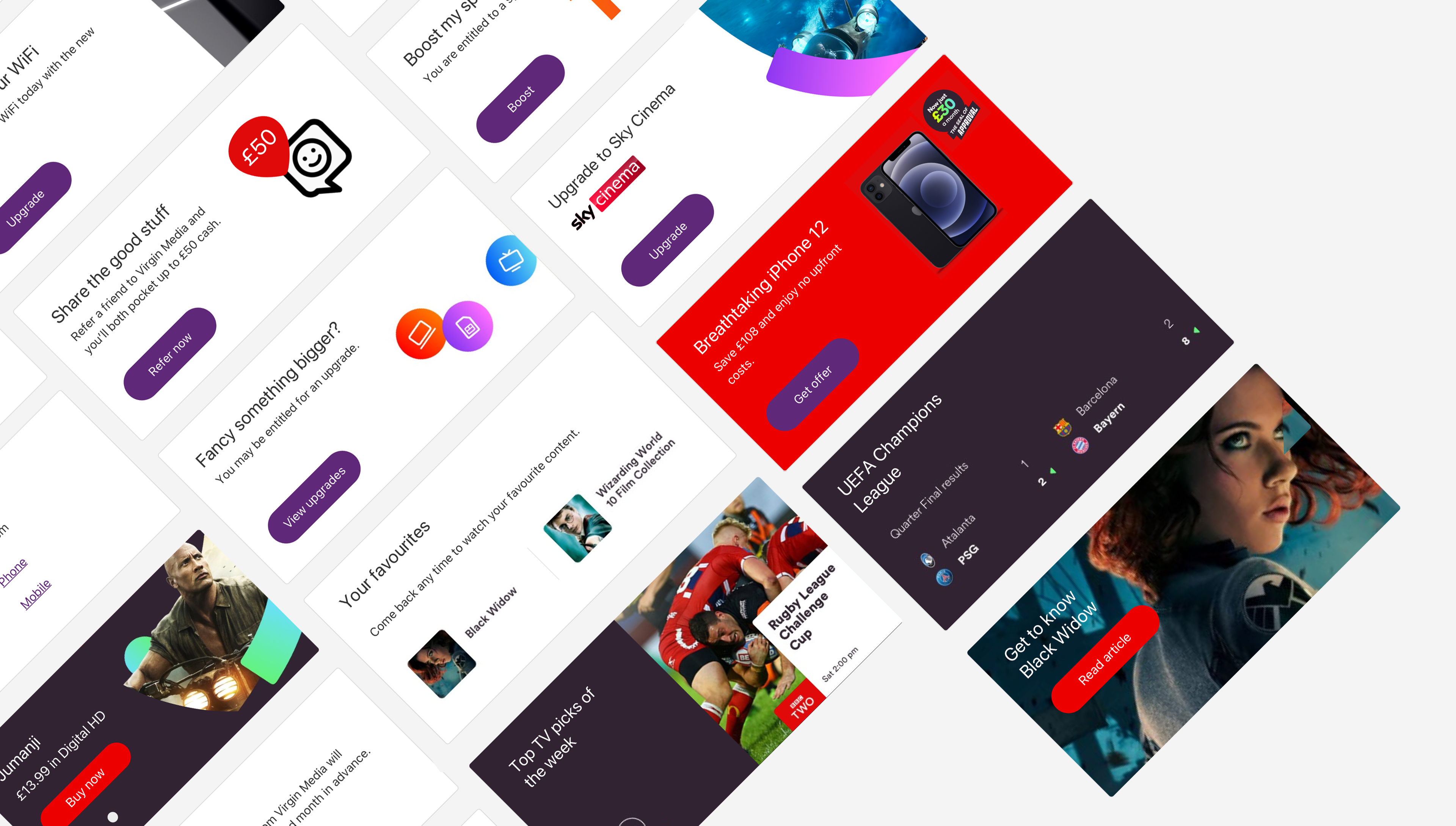
A modular bento block style was the heart of our visual design language, this gave us the flexibility we needed
With enough data captured we kicked off the phase, our approach to using a modular based system allowed us to start blocking out the portal starting with packages and slowly transitioning to help and support. We had additional creative from external agencies which gave us the chance to further push the Virgin Media branding and add additional engagement to the user experience.
As we had a very broad user range and a lot of customers struggling were in the senior category, we made sure during the entire design process that full AA accessibility and responsiveness were also prioritized, with efforts to ensure the design's accessibility to users with disabilities and optimisation for seamless performance across various devices and screen sizes.
As we had a very broad user range and a lot of customers struggling were in the senior category, we made sure during the entire design process that full AA accessibility and responsiveness were also prioritized, with efforts to ensure the design's accessibility to users with disabilities and optimisation for seamless performance across various devices and screen sizes.
Continuously liaising with the engineering dept and having their approval as we designed for components, we also simultaneously began fleshing out an early design system.

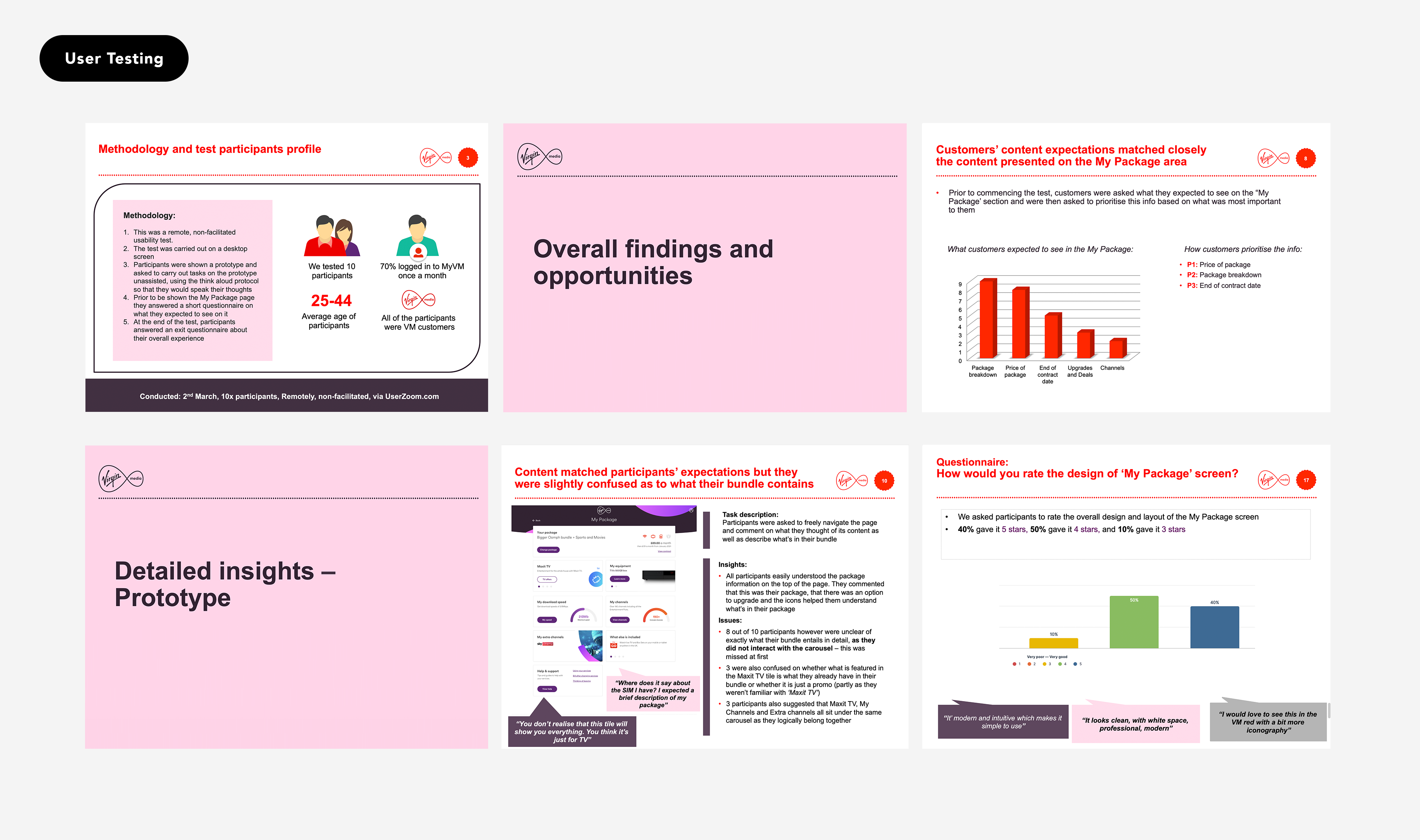
Conducting usability testing with existing Virgin Media customers to validate our design thinking and discover areas for further improvement
To ensure the usability and effectiveness of our designs, working very closely with the in-house UXR, we conducted quite a lot of user testing at Virgin Media. We invited a diverse group of users to test the prototypes and provide feedback. This user testing process allowed us to gather qualitative data on user experiences, identify any issues or areas for improvement, and make iterative refinements to the designs based on user feedback.
The insights gathered from user testing helped us ensure that the final product met the needs and expectations of a large customer base using multiple products such as TV, broadband, phone and mobile.
Conclusion
& Project Handoff
& Project Handoff
Whilst we were progressing on the redesign of the account screens, we were simultaneously working on a complete overhaul of the login journeys in terms of experience as well as visual look and feel.
Again working very closely with the product owner, engineers and researcher. We simplified the user flows, studied heatmaps on the pre-existing journey, reduced cognitive load on the experience visually as well as behaviourally and finally we synced the look and feel to that of account to create an entirely seamless Virgin Media experience.
In conclusion this was one of the largest projects I've worked on in my career, but was also very successful. The reason for this was a coordinated team, constant communication, daily catchups and the ability to research and test as much as we possibly could.
The challenges I overcame
The biggest obstacle I faced during this project was trying to think of a holistic solution that can cater for as many customer pain points whilst being adaptable throughout the portal experience. After many ideation sessions and eventually going through the route of a modular bento system allowed us to work closely with the engineers from the start to build a solution in which the portal managers can easily adapt to new products and feature releases.
We also faced a substantial challenge with the help section of My Virgin Media, the brands customer base is very broad so we had to cater a highly accessible structure that both younger and senior customers can enjoy to use.
The Impact
✓ Increased engagement with the Portal
✓ Large reduction in customer complaints
✓ Customers being able to now manage all subscriptions
✓ Heavily improved accessibility in the registration & sign in process
✓ Large reduction in customer complaints
✓ Customers being able to now manage all subscriptions
✓ Heavily improved accessibility in the registration & sign in process